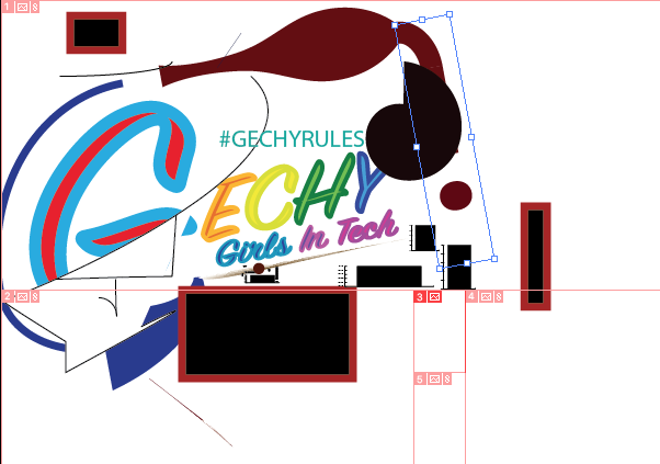
How I Designed
Right after our group chose a company name, I got to work on a logo. I decided to make the G in gechy a more bold and big letter (G is also one of the best letters, it is the first letter in the words Grace and Grinch). It took many takes and designs, but our group voted on what we thought would suit the company best.
The Way I Sketched
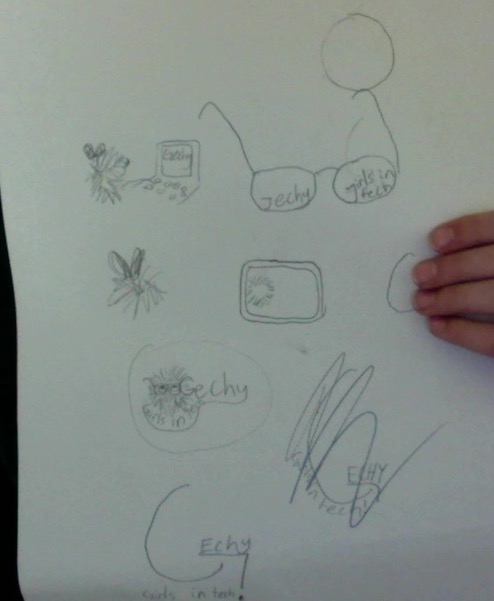
I started sketching and playing with things that I thought would be good. I messed around and had lots of fun with it to make it more creative and interesting:
Black+White Only!
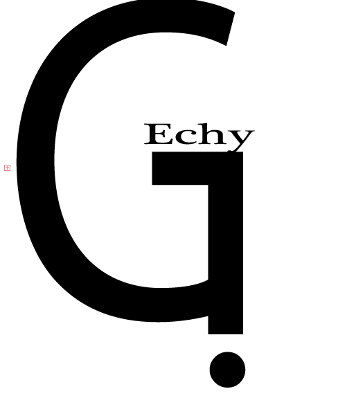
Our company thought it would be best if we kept our designs in black in white so when we voted, the colors wouldn't influence our oppinions:
Coloring the Design
Our group got together to decide on colors to use primarily in our logo; this helped give guideline for our color process:
IMPROVEMENTS
The company finally thought we had our main logo, so it was time to make some adjustments and improvements:
