Designing a Logo: The One Thing I Did
The first thing I did with Cloud Surfers was designing the company's logo. It was hard, and it took a while. If you care, you can read and laugh at my pathetic art skills and many shortcomings.
First Sketches
I began by sketching several (meaning one) possible idea(s) for (a) logo(s), inspired by the name and traits of our company.
Clearly I wasn't feeling too creative right then.
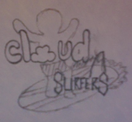
In case you couldn't tell, it is a surfer, near to a cloud. My inspirations were Keith Haring, Dadaism, and "Point Break."
*insert Keanu shooting sky*
Black and White
I then used Illustrator to make a black and white mockup of my logo. Try to spot the differences. It's really hard. Some are easy, but that's because I was too lazy and I really didn't want to.
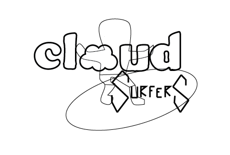
It's aliiiiive!!! Also, it's standing on a big egg.
Color
Sadly, nobody liked the product of my hard work (waaaah), so. with a heavy heart, I then made color versions of these:

Although nobody liked them. Including me. I guess you could say they were avant-garde, but another fair descriptor is "seizure-inducing."
Improvements
Nobody liked my designs (see above), so I made some final, nit-picky adjustments, creating this logo:

Thus ends my tale of frustration, rejection, and devastation.
VRY IMPOTENT MASSAGE
"Omg jyew! But it wooden work becas thers a lizded on it."
"... NOOOOOOOOOOOOO! Now the yew is gunna wkr!"
...
...
...
As is traditional, we now take a really long pause and come back to end on "25 or 6 to 4."